Wavefront users are responsible for finding anomalies in their data. That task becomes harder as the amount of data increases. Wavefront already includes anomaly detection based on statistical functions, such as standard deviation. Anomaly detection takes a different approach, offering anomaly detection based on neural network powered forecasting methodology.
Anomaly Detection Use Case
Anomaly Detection offers a way of showing anomalies on the chart.
Assume that SRE Robin has received an alert that an application is slow.
- Robin reviews the dashboard that monitors the application but cannot immediately see a problem.
- Robin turns on the anomaly detection functionality, sees that an area is highlighted, and filters to see only the anomalous behavior.
- Robin shares the results with the team, and creates an alert for anomalies on this time series to ensure the team is notified in case of similar problems.
How to Use Anomaly Detection on Charts
Currently, Anomaly Detection is available for Line Plot charts.
-
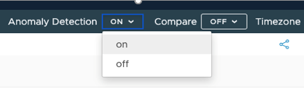
Enable Anomaly Detection from two places:
-
By turning Anomaly Detection on from the top-right menu, under the Wavefront toolbar.
-
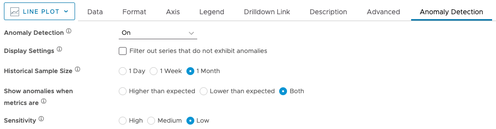
By clicking the Anomaly Detection tab in the Chart Editor and turning anomaly detection On.
-
-
On the Anomaly Detection tab, with Anomaly Detection turned on, you can customize the Display Settings, Historical Sample Size, Anomaly Type, and Sensitivity.
- Display Settings – Select this option to filter out all the series that don’t have anomalies. This option is useful for visualizing series with anomalies better.
- Historical Sample Size – Allows you to define the size of the history window where chart forecasting is done. The size of a history window defines a granular time bucket to compare the chart behavior for finding anomalies. If you want to look for seasonal anomalies, select the appropriate history window, such as one week or one month. One-day historical sample size window helps you detect hourly anomalies.
- Anomaly Type – Allows you to filter out the anomalies that are higher than expected, lower than expected, or both.
- Sensitivity – Select high, medium, or low sensitivity. High means that there’s a 67% chance that the data is anomalous, Medium means there’s a 95% chance, and Low means there’s a 99% chance.
How to Use Anomaly Detection on Dashboards
You can enable Anomaly Detection on dashboards that contain Line Plot charts.
- Open a dashboard.
-
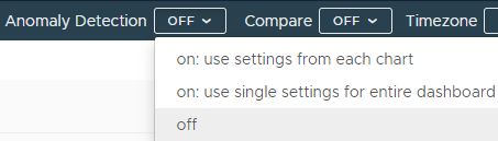
Click the Anomaly Detection drop-down menu on top.
-
Select an option:
Option Description on: use settings from each chart Enables Anomaly Detection on the dashboard by taking the configuration options from each chart.
This way you can configure the dashboard in a more flexible way by enabling or disabling Anomaly Detection only on the charts that you want, and configuring each chart with the settings that you want.
on: use single settings for entire dashboard Eenables Anomaly Detection on all Line Plot charts within the dashboard and apply the same settings to all of them. This way, you can change anomaly detection settings from one place for all the Line Plot charts in the current dashboard.
off Use this option to turn Anomaly Detection off for the whole dashboard. -
If you select to use the on: use single settings for entire dashboard option, click the modal icon displayed next to the Anomaly Detection switch, and select the Anomaly Detection options.

- Display Settings – Select this option to filter out all the series that don’t have anomalies. This option is useful for visualizing series with anomalies better.
- Historical Sample Size – Allows you to define the size of the history window where chart forecasting is done. The size of a history window defines a granular time bucket to compare the chart behavior for finding anomalies. If you want to look for seasonal anomalies, select the appropriate history window, such as one week or one month. One-day historical sample size window helps you detect hourly anomalies.
- Anomaly Type – Allows you to filter out the anomalies that are higher than expected, lower than expected, or both.
- Sensitivity – Select high, medium, or low sensitivity. High means that there’s a 67% chance that the data is anomalous, Medium means there’s a 95% chance, and Low means there’s a 99% chance.
- Click Apply.
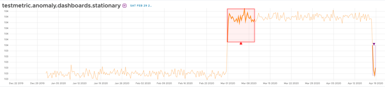
Anomaly Highlighting
On the chart, the anomalies are highlighted with a square purple border or a cycle purple border. Square purple borders are used to highlight large anomalies and cycle purple borders are used to highlight small anomalies.
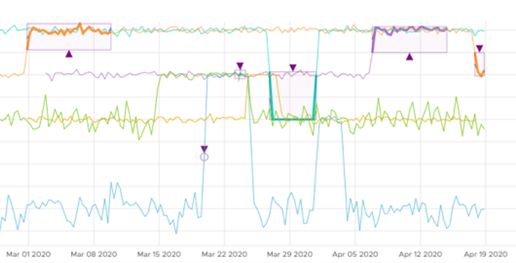
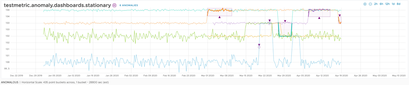
In anomaly detection mode, you can highlight an anomaly. On top of the chart, you can see the amount of the anomalies on the current chart. When you click it, a drop-down menu appears. This drop-down menu contains the series with anomalies, where each series contains anomalies sorted by time in that series.
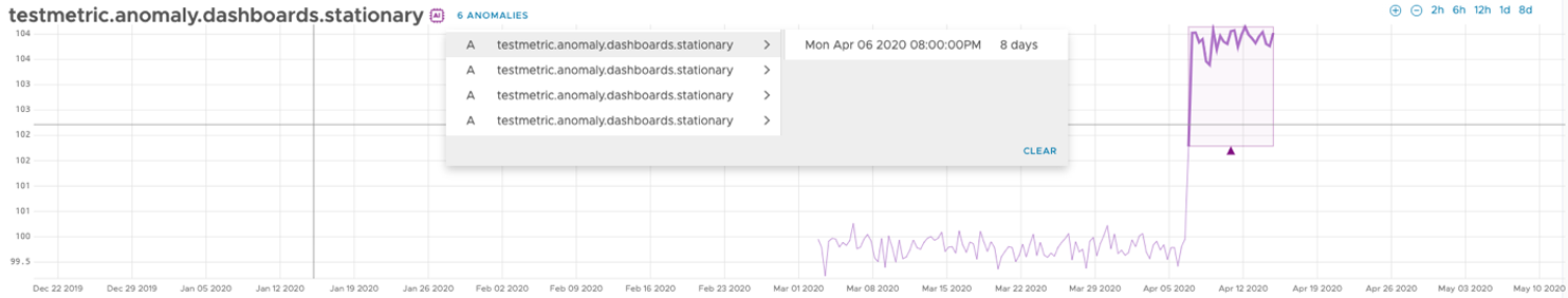
When you select a series, you will filter out all other series and the chart shrinks for better visualization of the anomalies.
If you select a specific anomaly, the anomaly is highlighted red on the chart.