It’s important to understand how you use your Tanzu Observability (formerly known as VMware Aria Operations for Applications) service, whether you will be billed for more data, and whether you will need to request more data. Typically, billing is based on the amount of data that you send to our service, measured in Points per Second (PPS). If your scan rate exceeds more than 20x the ingestion rate, you will be billed based on the scan rate. If you exceed your committed rate, you will be charged for overage usage.
You can examine the overall usage of your Tanzu Observability service by using the Usage Summary dashboard, discussed here.
For monitoring the ingestion rates by specific accounts, sources, metric namespaces, and point tags, you can use ingestion policies.
For performance monitoring of your Tanzu Observability service, you can use wftop and spy, the Slow Query dashboard, and the Usage integration.
How to Go to the Usage Summary Dashboard?
You can navigate to the Usage Summary dashboard and get an overview of your ingestion and scan rates per billing period. You can go up to 2 years back in time.
- Log in to your service instance.
-
From the gear icon on the toolbar, select Usage Portal.
Tip: If you are a Super Admin user and enabled Super Admin mode, the menu item is Usage and Subscriptions.The Usage Summary tab opens. This tab contains the dashboard with charts of your ingestion and scan rates.
- From the Billing Month drop-down menu, select the billing period you are interested in.
Understand the Data
The Usage Summary dashboard shows your PPS usage over the selected billing period.
Here’s an example of how the dashboard may look like if you have a billable commit contract.
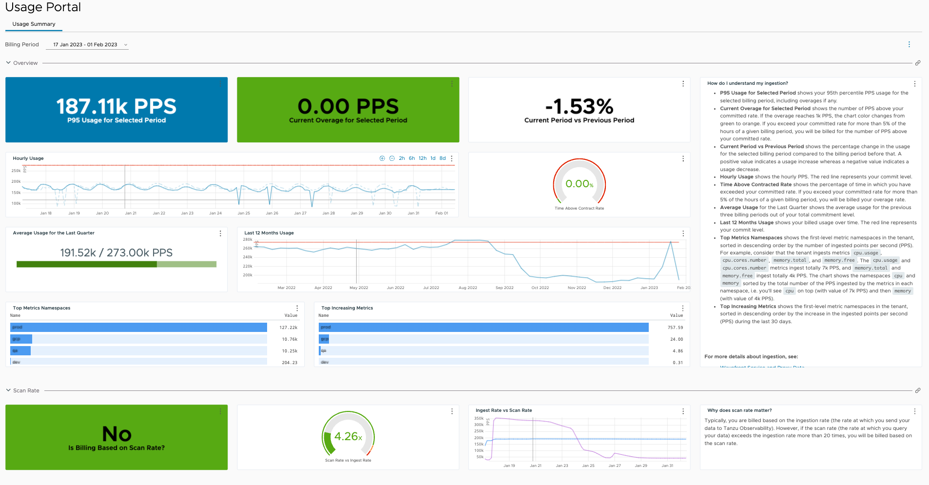
The charts are organized in the following sections.
Overview Charts
The Overview section of the dashboard contains the following charts:
| Chart | Description |
|---|---|
| P95 Usage for Selected Period | Shows your 95th percentile PPS usage for the selected billing period, including overages if any. |
| Current Overage for Selected Period
(Only for billable customers) |
Shows the number of PPS above your committed rate. If the overage reaches 1k PPS, the chart color changes from green to orange.
Important: If you exceed your committed rate for more than 5% of the hours of a given billing period, you will be additionally billed for the number of PPS above your committed rate. |
| Remaining Balance vs Burndown Commitment
(Only for burndown customers) |
Shows your remaining number of PPS out of your burndown commitment. |
| Current Period vs Previous Period | Shows the percentage change in the usage for the selected billing period compared to the billing period before that. A positive value indicates a usage increase whereas a negative value indicates a usage decrease. |
| Hourly Usage | Shows the hourly PPS usage over the selected billing period. The dashed line represents the PPS usage over the previous billing period.
If you have a billable commit contract, the red line represents your committed rate. |
| Time Above Contract Rate
(Only for billable customers) |
Shows the percentage of time for which you have exceeded your committed rate. If you exceed your committed rate for more than 5% of the hours of a given billing period, you will be addtionally billed for your overage rate. |
| Average Usage for the Last Quarter | Shows the average usage for the previous three billing periods.
If you have a billable commit contract, the usage is presented out of your total commitment level. |
| Last 12 Months Usage | Shows your billed usage over time.
If you have a billable commit contract, the red line represents your committed rate. |
| Top Metrics by Namespace | Shows the first-level metric namespaces in the tenant, sorted in descending order by the number of ingested points per second (PPS). For example, consider that the tenant ingests metrics cpu.usage, cpu.cores.number, memory.total, and memory.free. The cpu.usage and cpu.cores.number metrics ingest totally 7k PPS, and memory.total and memory.free ingest totally 4k PPS. The chart shows the namespaces cpu and memory sorted by the total number of the PPS ingested by the metrics in each namespace, i.e. you'll see cpu on top (with value of 7k PPS) and then memory (with value of 4k PPS). |
| Top Increasing Metrics | Shows the first-level metric namespaces in the tenant, sorted in descending order by the increase in the ingested points per second (PPS) during the last 30 days. |
Scan Rate Charts
Typically, you are billed based on your ingestion rate (the rate at which you send your data to Tanzu Observability). However, if your scan rate (the rate at which you query your data) exceeds 20 times your ingestion rate, you will be billed based on the scan rate.
The Scan Rate section of the dashboard contains helps you explore scan rates:
| Chart | Description |
|---|---|
| Is Billing Based on Scan Rate? | Shows whether you are currently billed based on your scan rate. |
| Scan Rate vs Ingest Rate | Shows how many times the ingestion rate is the scan rate. |
| Ingest Rate vs Scan Rate | Compares your ingestion rate with your scan rate over time. |
Learn More!
For more in-depth exploration on the usage of your Tanzu Observability service, see the Usage integration-related documentation:
- Monitor Your Service.
- Find Actionable Usage Information.
- Monitor Wavefront Proxies.
- Purchase Additional Capacity
Our Customer Success Team has put together a KB article that drills down into adoption info.