Tanzu Observability (formerly known as VMware Aria Operations for Applications) includes many out-of-the box dashboards, and supports creation and fine-grained customization of dashboards. You organize the information about your environment and fine-tune what users see. For example:
- Organize charts into sections.
- Perform global operations such as setting the dashboard time window.
- Use dashboard variables.
Examine Data with Dashboards and Charts explains how to set dashboard preferences, set the dashboard time window, isolate sources and series, and more.
Video
Users with the Dashboards permission can create a new dashboard with one or multiple charts from metrics, a chart type, or an integration. You can also watch the video here  . Note that this video was created in 2020 and some of the information in it might have changed. It also uses the 2020 version of the UI.
Create a Dashboard
You have several options for creating a dashboard:
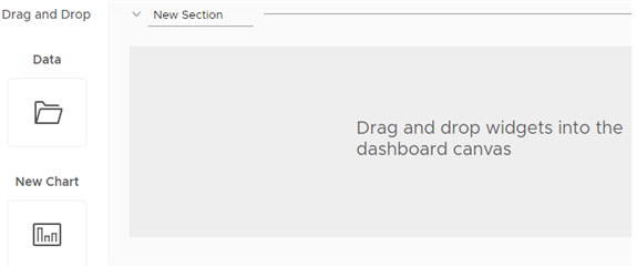
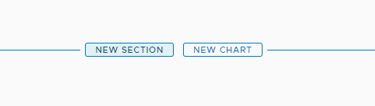
- Select Dashboards > Create Dashboard, drag in the Data or New Chart widget, and follow the wizard to create a single-chart or multi-chart dashboard.
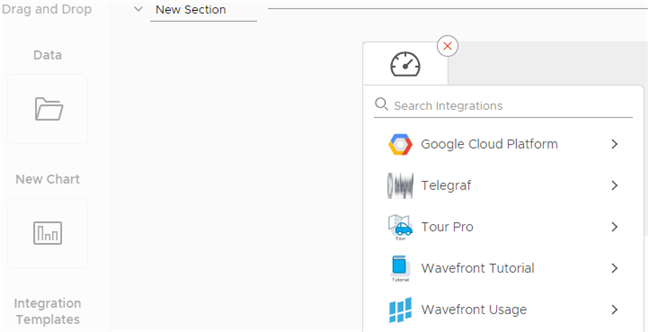
- Select Dashboards > Create Dashboard, drag in the Templates widget, and select an integration, then pick the dashboards and charts you’d like to include.
- Select Dashboards > All Dashboards and click Create Dashboard
- Select Browse > Metrics and click Create Dashboard.
Create a Dashboard from Metrics Data or Charts
It’s easy to create a dashboard from metrics data or by selecting a chart.
To create a dashboard:
|
 |
Create a Dashboard from Integration Templates
You can create a dashboard by specifying an integration dashboard as a template.
To create a dashboard:
|
 |
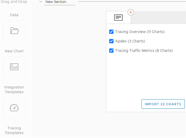
Create a Dashboard from a Tracing Template
Our service dashboard includes a set of charts to monitor the trace data sent by each service in your application. You can use the service dashboard as a template to create your dashboard and then customize the charts for your environment.
To create a dashboard:
|
 |
Take a look at the cool actions you can do using these charts:
- Explore the Default Service Dashboard and navigate to the Tracing UI from the Service Dashboard.
- To delete or edit a chart, see Clone, Delete, or Edit a Chart.
Create a Dashboard by Importing Sections from Other Dashboards
You can create a dashboard by importing sections from other dashboards.
To create a dashboard:
|
 |
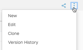
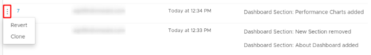
Edit or Clone a Dashboard
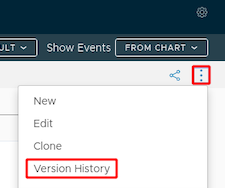
The dashboard menu allows you to create a dashboard, edit a dashboard, clone a dashboard, and look at the dashboard version history.
- When you clone a dashboard, you copy the dashboard. If you want to customize one of the read-only dashboards, such as integration dashboards, just clone the dashboard and edit the clone.
- The dashboard version history tracks each saved version and includes the user who saved the version. The result is an audit trail for the dashboard.
To edit a dashboard:
|
 |
To clone a dashboard:
|
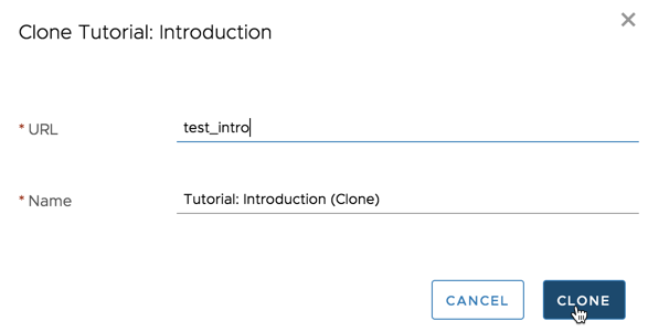 |
Examine Metrics in Dashboard View Mode
All users can examine metrics, set the time window, and make temporary changes to dashboards. See Examine Data for details.
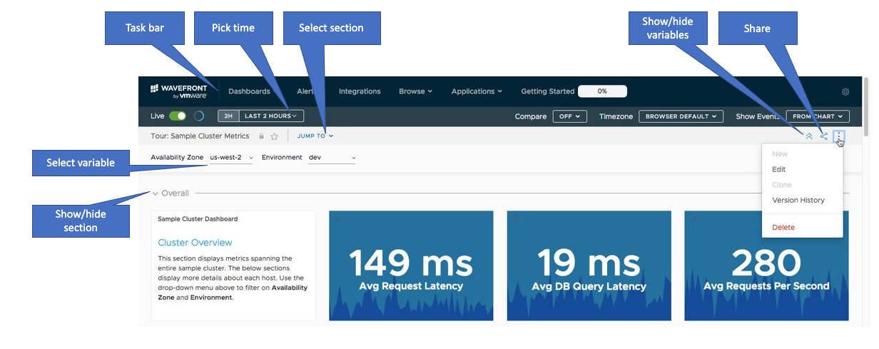
Here are some examples of what all users can do:
- Set and fine-tune the time window
- Find a dashboard section
- Filter with global filters or dashboard variables
- Find a dashboard
- Isolate sources or series
Make Changes to a Dashboard in Edit Mode
When you create a dashboard or when you edit a dashboard, the dashboard is in Edit mode. In Edit mode, you can make several changes at a time, then save all changes to dashboard layout or to charts.
| A system dashboard has a lock icon next to the name. | 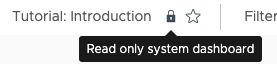 |
Here are some actions you can perform in a dashboard.
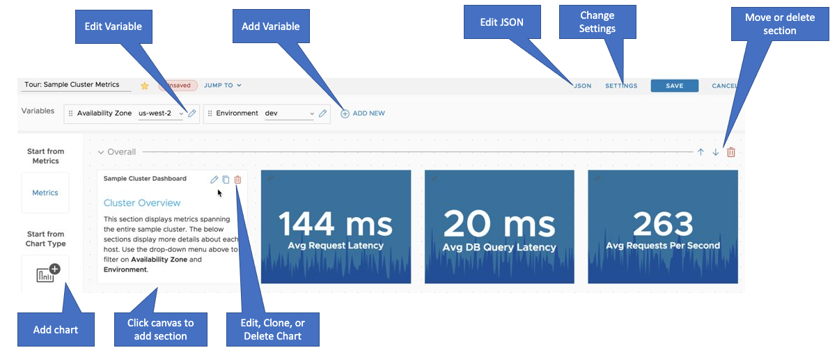
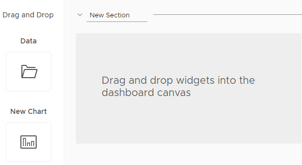
Add a Chart Using Drag and Drop
|
 |
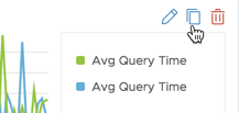
Clone, Delete, or Edit a Chart
Editing a chart is different in View mode and in Edit mode:
- With a dashboard in View mode, click the chart title to edit a chart.
- With a dashboard in Edit mode, use the icons on any chart.
|
 |
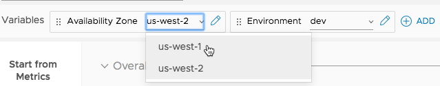
Add or Edit Dashboard Variables
With the dashboard in Edit mode:
|
 |
Change Dashboard Layout
With the dashboard in Edit mode:
|
 |
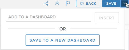
Add a New or Cloned Chart
When you create a chart using Dashboards > Create Chart, you’re prompted to save it to a dashboard. When you edit a chart, you can save to the current dashboard, or save a clone to a different dashboard.
|
 |
Undo and Revert Undo Operations
You can undo dashboard changes.
|
 |
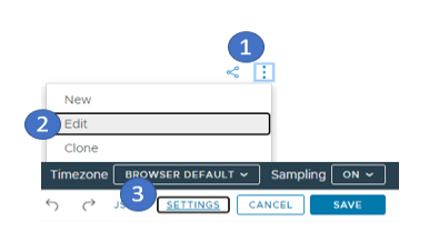
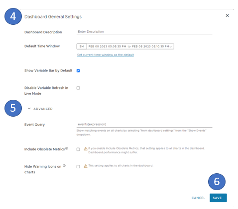
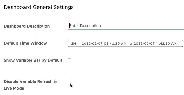
Set Dashboard Display Preferences and Settings
For each dashboard, you can customize display preferences and settings.
To set the dashboard settings:
|
|
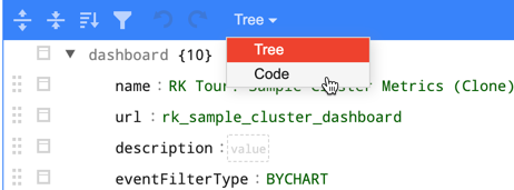
Edit the Dashboard JSON
Most users create and edit dashboards by using the GUI or automate the process with the REST API. But at times, it’s convenient to edit the dashboard JSON directly from the UI and see results immediately.
|
 |
Conditional Dashboard Sections
You can make dashboard sections conditional by using the JSON editor. If a dashboard has conditional sections:
- Each section is shown only if the condition is met, and invisible in the Jump To menu and the dashboard.
- If the condition is met:
- The Jump To menu shows a number to indicate how many conditional sections are displayed. Default color is grey.
- A customizable tooltip indicates that the section is conditional.
- The number and tooltip also display next to the conditional section.
The following JSON snippets shows dashboard attributes and dashboard sections to use for conditional sections.
Customize Dashboard Attributes
Customize Dashboard Sections to Be Conditional
Example: Add Conditional Sections
This somewhat contrived example:
- Uses a condition that’s always true for the
Proxy Troubleshootingsection. - Uses the SEVERE color to show conditional sections are included.
- Specifies the tooltip in the
descriptionfield.
Here’s the snippet that:
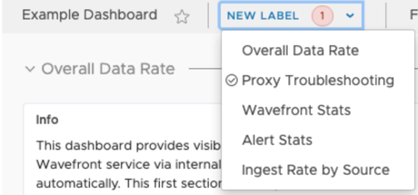
- Changes the label from
Jump TotoNew Label, a good way to make sure things are working while experimenting. - Sets the color for the condition badge, a small circle with the number of conditions inside. If the condition is met, the badge is shown on the Jump To menu and on next to the conditional section.
{
  "name": "Example Dashboard",
  ...
  "dashboardAttributes": {
    "jumpToLabel": "New Label",
    "conditionBadgeColor": "SEVERE"
  }
  ...
}
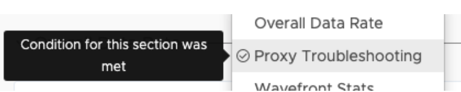
Here’s the section filter that conditionally shows the Proxy Troubleshooting section. This example uses a query that is always true (1 > 0), and includes the tooltip text Condition for this section was met.
"sections": [
  {
    "name": "Proxy Troubleshooting",
    ...
    "sectionFilter": {
        "query": "1 > 0",
        "description": "Condition for this section was met"
    }
    ...
  }
  ...
]
After you’ve saved these changes:
The Jump To menu uses the NEW LABEL text and shows 1 to indicate there's one conditional section, in red (SEVERE).
 |
Hover text alerts the user that the section is conditional - you can change the text as appropriate.
 |
Ensure Optimal Dashboard Performance
Video: Optimize Dashboard Performance
Watch this video to learn how to optimize dashboard and query performance. Note that this video was created in 2021 and some of the information in it might have changed. It also uses the 2021 version of the UI.
Our service can ingest and process very large amounts of data. Here’s what you can do to ensure performance is optimal.
Watch for Cardinality Issues
Ensure your data shape works well. Ingest only time series you need – and then look only at those data you’re interested in.
- See High Cardinality Data for some background and a video.
- See Optimizing the Data Shape to Improve Performance for an in-depth discussion with examples.
Optimize Query Performance
Wavefront Query Language (WQL) has a rich set of options. See Optimize Query Performance for details.
- At times, you have to choose between precision and speed.
- At other times, customizing your query to filter out data you don’t need improves performance significantly.
Use Sampling Settings for the Dashboard or Individual Charts
You can limit the number of time series to 100 either at the dashboard level or for individual charts. See Improve Display Speed with the Sampling Option for details.
Use Live Mode with Care
Dashboards are either set to a specified time window or to Live mode. In Live mode, the time window for a chart determines how often the charts in a dashboard refresh.
- Charts with a time window of 5-10 minutes reload every second.
- Charts with a larger time window (e.g. 4 hours or 1 day) reload every 30 second.
Do not run charts with a 5-10 minute time window for a long time in Live mode.
Display the Events You Need
Querying metrics and querying events are different tasks. By default, each chart displays all source events and system events as black points or stars at the bottom of each chart. Those queries affect chart and dashboard performance. With the 2022-40.x release, the default option for newly created dashboards is set to None, i.e. all events from every chart in the dashboard are hidden by default.
You can:
- Select an individual chart, click the Format tab, and deselect Display Source Events.
- Adjust events for the whole dashboard by using the Show Events drop-down menu in the top right.
See Control Event Overlays for details and screenshots.
Use Dynamic Dashboard Variables with Care
Dynamic dashboard variables are used to display a list of possible values to the end user. The values are computed by a query.
Avoid using expensive queries in dynamic dashboard variables. If the query for the dynamic dashboard variable is complex, it slows down the dashboard loading. Keep queries simple, and consider using a derived metric, which uses a query that has already been executed and stored.
Turn off Dynamic Dashboard Variable Live Refresh
When a dashboard has a lot of variables with interdependencies, it might make sense to turn off live refresh for dynamic variables. Only users with Dashboards permission can toggle this setting.
Going forward, Variable Refresh Disabled info text show up to the right of the variables bar. Users no longer see the potentially distracting refresh of each chart. An explicit brower refresh updates all variables. |
 |
Identify Unused Dashboards
Over time, as more and more dashboards are created, there will be dashboards that are no longer in use. To keep your environment clean and to ensure that useful dashboards can be easily found, it’s a good practice to delete unused dashboards on a regular basis. To do that, you must first identify which dashboards are no longer being used or viewed.
-
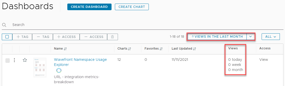
Use the Dashboard Browser to sort the dashboards in ascending order by the number of views over the last day, week, or month. This puts the fewest viewed dashboards at the top of the list.
-
Use the REST API and UI to check for dashboards that have not been viewed over a time window of your choice, including more than 4 weeks (a month).
- Get the IDs of all dashboards.
- From the gear icon on the toolbar, select API Documentation.
-
Expand the Dashboard category and click the
GET api/v2/dashboardrequest.Note: You may need to iterate through all the available dashboards by using theoffsetparameter in the API request. -
Click Execute.
The
idvalue for each entry in the response is the dashboard ID.
-
In the UI, find all dashboards that have been viewed over the time window of interest.
The internal metric
~wavefront.dashboard.<dashboard_id>.viewstracks the views of each dashboard.Create a table chart with the query of the type:
aliasMetric(mmax(12w, ts(~wavefront.dashboard.*.views)), 2)You will get the IDs of the dashboards that have been viewed over the last 12 weeks.
-
Find all unviewed dashboards.
Now that you have the IDs of all dashboards and the IDs of all dashboards that have been viewed, you can take the difference and get all of the IDs of the unviewed dashboards.
- Get the IDs of all dashboards.
Delete and Recover a Deleted Dashboard
You can delete a single or multiple dashboards that you no longer use. After you delete a dashboard, it is moved to the trash for 30 days before it gets permanently deleted. If a dashboard has been permanently deleted, users will no longer be able to restore it without the assistance of a Super Admin. See Recover a Permanently Deleted Dashboard for details.
To delete a dashboard:
- Select Dashboards > All Dashboards.
- Search for and select the check boxes of the dashboards that you want to delete.
- Click the delete icon on top and confirm the deletion.
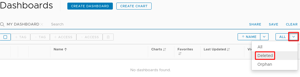
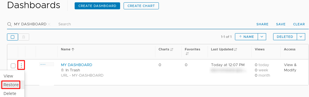
To restore a deleted dashboard from the trash:
- Select Dashboards > All Dashboards.
-
From the All menu in the top right of the list of dashboards, select Deleted.
- Search for and select the dashboard that you want to restore.
-
Click the ellipsis icon and select Restore.
Audit Dashboard Changes
Users need to audit dashboard changes in several situations:
- A dashboard was saved with incorrect changes and the previous configuration isn’t known.
- A dashboard was changed. An audit needs to determine when it was updated and by whom.
- A dashboard was deleted. Audit needs to determine when it was deleted and by whom.
Each time you save a dashboard, you create a dashboard version. Up to 100 versions are supported.
To audit or restore a dashboard:
|
 |
Troubleshoot and Learn More!
- Troubleshooting Missing Data can help if you don’t see what you expect.
The Customer Success team prepared this KB article about migrating data between environments: